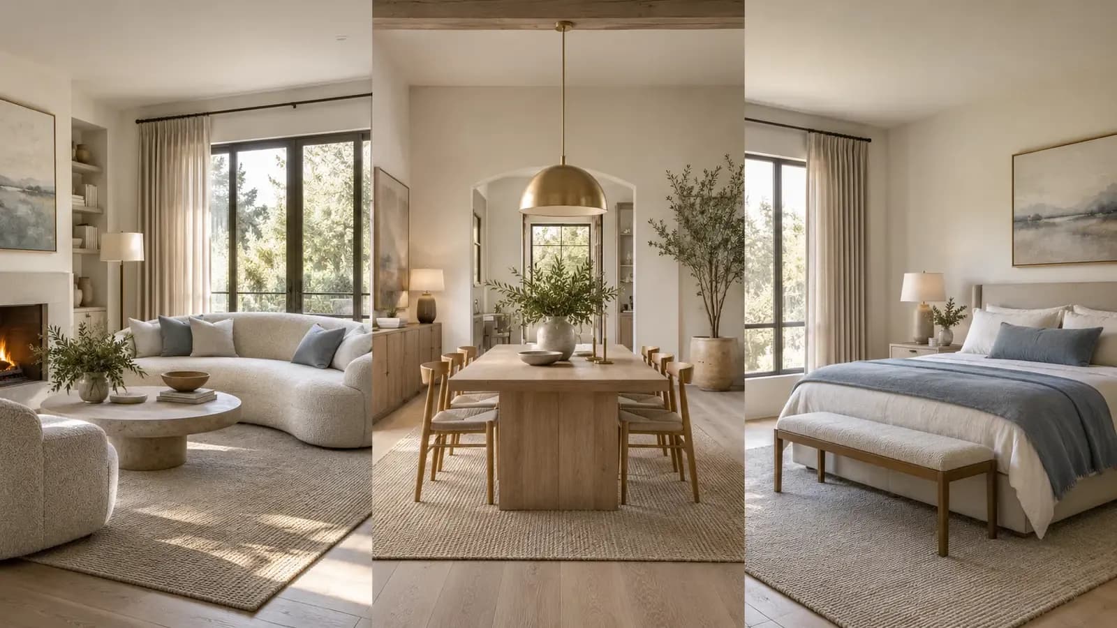


The fastest way to make a multi-room design feel disjointed is to design each room in isolation.
One room becomes warm and minimal. The next is filled with cool gray furniture. A third introduces ornate lighting and glossy finishes. Each image may look attractive on its own, yet the home no longer feels like one project.
AI can make this problem worse because generating another room is so easy. Choose “Modern” three times and you may still receive three different interpretations of modern. A broad style label does not define which wood tone to repeat, how much contrast to use, what shapes should dominate, or how restrained the décor should feel.
The solution is not to make every room identical. It is to give every room the same underlying design logic.
A Consistent Home Is a System, Not a Copy
Rooms have different jobs. A living room needs conversation and circulation. A bedroom needs visual quiet. A dining room may tolerate a stronger focal point. Repeating the exact sofa shape, pendant light, rug, and artwork everywhere would feel staged rather than cohesive.
What should repeat is the relationship between elements.
That relationship can usually be described through six design signals:
- Color: the dominant neutrals, supporting colors, and accent colors.
- Materials: the recurring woods, metals, stone, upholstery, and surface finishes.
- Shape: whether furniture and details favor straight lines, soft curves, or a mix.
- Visual weight: whether the space feels light and open or grounded and substantial.
- Contrast: how strongly light and dark elements differ.
- Mood: calm, formal, playful, organic, dramatic, or another clear emotional direction.
Homes & Gardens' explanation of repetition in interior design likewise describes recurring colors, materials, textures, and shapes as a way to create rhythm and cohesion, while retaining contrast so a room does not feel flat. That is more useful than reproducing one room item by item.
If those signals remain recognizable, a bedroom can be softer than the living room and still belong to the same home.

Why a Style Name Is Usually Not Enough
Terms such as Modern, Scandinavian, Japandi, or Mid-Century are useful starting points, but they leave too much room for interpretation.
Two people can both ask for a Scandinavian interior and imagine very different rooms. One may picture pale oak, soft gray textiles, and almost no decoration. Another may expect white walls, black metal accents, colorful art, and warmer rustic furniture.
A reference image carries decisions that the label does not:
- The exact balance between warm and cool colors
- Whether the wood is pale, honey-toned, reddish, or dark
- Whether metal details are matte black, brushed brass, chrome, or absent
- Whether upholstery is smooth, textured, tailored, or relaxed
- How much empty space is left around furniture
- Whether lighting is soft and atmospheric or bright and graphic
This is why AI interior design from a reference image can be more specific than choosing a preset. The image gives the system a visual example of the relationships you want to preserve.
It still needs judgment. A reference image should be treated as a source of design rules, not a command to copy every visible object.
Choose a Reference Image That Can Carry a Whole Project
Not every attractive image makes a good master reference.
A close-up of one chair may communicate upholstery and color, but it says little about spatial rhythm, lighting, or the balance of materials. An editorial image with dramatic colored lighting may create a strong mood but provide poor guidance for everyday rooms. A photograph dominated by one unusual architectural feature may lead the design away from the actual property.
A strong reference image usually has:
- A clear and coherent palette
- Two or three identifiable material families
- Furniture silhouettes that suit the project
- Lighting that could plausibly work in other rooms
- Enough of the room visible to understand composition
- A style compatible with the property's architecture
The image should represent the overall direction. If the project is quiet, warm, and natural, do not choose a reference merely because one statement lamp looks appealing.
For professional work, use your own imagery, licensed material, or client-approved references whenever possible. The U.S. Copyright Office distinguishes protected original expression from ideas and concepts. A responsible workflow extracts general design characteristics instead of attempting to reproduce another creator's image exactly.
Turn the Reference Into a Small Set of Rules
Before applying the style to another room, describe what must remain consistent.
For example, a reference could become this compact style brief:
Design layer | Reusable rule |
|---|---|
Base palette | Warm white and light beige |
Wood | Pale oak with a matte finish |
Accent color | Muted gray-blue, used sparingly |
Metal | Brushed brass in small details |
Furniture shape | Soft curves balanced by simple straight lines |
Textile character | Natural, lightly textured, low sheen |
Lighting | Diffused daylight and warm ambient lamps |
Styling density | Restrained, with visible negative space |
This is enough direction to create continuity without prescribing one fixed room.
The living room might use gray-blue cushions. The bedroom might carry the same accent through a throw or upholstered bench. The dining room may use it only in artwork. The color moves through the project, but its role changes with the room.

Adapt the Style to Each Room's Function
Consistency should never override use.
A bedroom needs fewer competing focal points than a living room. A home office requires task lighting and a workable desk, even if the reference image is centered on soft ambient light. A dining room needs clearance around chairs. A narrow hallway cannot support the same visual weight as an open-plan living area.
Keep the rules, then change their expression:
Room | How the shared style can adapt |
|---|---|
Living room | Use the full palette and broadest material mix to establish the visual language. |
Bedroom | Reduce contrast, soften textiles, and limit competing focal points. |
Dining room | Repeat the wood and metal finishes, then allow one stronger pendant or artwork. |
Home office | Preserve the palette and shapes while prioritizing ergonomics, storage, and task lighting. |
The room should feel like a relative of the reference, not its duplicate.
Keep a few high-level anchors stable and vary the supporting details. Repeat a warm white base, one wood family, a metal finish, and an accent color, but allow rugs, artwork, and decorative pieces to respond to each room. When reviewing AI-generated options, compare the rooms side by side and ask whether they belong to the same client, property, and design idea.
What to Check Before Approving a Multi-Room Set
A simple visual audit catches most inconsistencies:
- Do the dominant whites and neutrals have the same temperature?
- Does the wood shift unexpectedly from pale oak to dark walnut?
- Are metal finishes coordinated?
- Do furniture shapes share a similar level of softness or structure?
- Is one room much more decorated than the others without a reason?
- Does every room respect its own architecture and function?
- Has the AI changed windows, doors, walls, or built-in features?
- Are furniture scale and circulation believable in each space?
That final point matters. Style consistency does not compensate for poor spatial judgment. A matching sofa is still wrong if it blocks a doorway or overwhelms the room. The guide to why AI virtual staging can look unrealistic explains how to review scale, perspective, lighting, and fixed structure.
How Astage AI Supports Style Extraction and Reuse
Astage AI for interior designers allows a designer to upload a reference image, extract its visual style, and apply that direction to another room. Instead of relying only on a broad preset, the reference can carry a more specific combination of color, materials, mood, and visual character.
Style DNA can then serve as a reusable design direction across projects or rooms. The goal is not to remove the designer's decisions. It is to reduce the work of repeatedly translating the same visual language into new prompts and disconnected generations.

The designer still decides whether the reference is appropriate, which characteristics should carry over, and where the new room needs to differ. AI accelerates visualization; it does not replace the reasoning that makes a multi-room design coherent.
For concepts that move toward purchasing, AI virtual staging with real furniture explains how a staged room can connect visual direction with products that users can review and buy.
Frequently Asked Questions
How do you keep interior design consistent across rooms?
Repeat a small set of design rules across the project: color temperature, material families, furniture shapes, contrast, lighting character, and styling density. Adapt those rules to the function of each room rather than duplicating the same furniture.
Can AI copy an interior design style from a reference image?
AI can analyze visual characteristics in a reference image and use them to guide another room. Results should be reviewed for architecture, function, furniture scale, and whether the important style signals were carried over appropriately.
What is AI style extraction for interior design?
AI style extraction identifies visual characteristics such as palette, materials, shapes, contrast, and mood in a reference image so that a related direction can be applied to another space.
Is using a reference image the same as copying a design?
It should not be. A reference can communicate general qualities and design direction. For professional or commercial work, use images you own, have permission to use, or are properly licensed, and avoid attempting to reproduce another creator's protected expression exactly.
The Best Consistency Is Felt Before It Is Noticed
When a multi-room design works, people do not need to see the same sofa or light fixture twice. They recognize the shared logic: the same warmth, restraint, material language, and attitude toward space.
That is the useful role of a reference image. It turns an abstract preference into a visual brief. Style extraction can make that brief easier to reuse, while the designer decides how it should change from room to room.
Explore Astage AI for Designers to turn a reference image into a reusable design direction for new spaces.